There's no direct cost since it's free and open source; the real cost is the time to learn the token/theme system, to weigh against the speed gained from ready-made accessible components.
About
In practice. What you can do with Chakra UI.
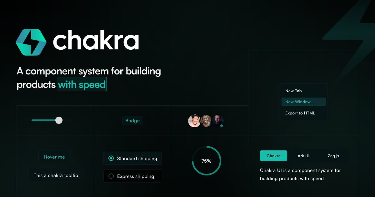
Chakra UI provides accessible, pre-built React components (sliders, tabs, menus, switches, pin inputs) with built-in focus styling and animations, so a team doesn't style every control from scratch. Design system tooling includes semantic design tokens, centralized typography and recipe-based component variants, with dark mode built in.
It's free and open source with no paid tier, but works with React only, so it isn't an option for Vue, Svelte or other frameworks. Fully customizing the design means adopting Chakra's token and theme system, which adds a learning curve compared to plain CSS. It suits a developer building a product UI who wants accessible defaults without building a design system from scratch.
Practical uses
Admin UIBuild an accessible dashboard with pre-built components (tabs, menus, switches) instead of styling each control from scratch.
Design consistencyApply semantic design tokens and recipe-based variants to keep components consistent across light and dark mode.
Features & use cases
Design system
UI components
Pros and cons. What Chakra UI does well, and what to expect.
Pros
Free and open source, with accessible components and built-in focus styling out of the box.
Design tokens, centralized typography and recipe-based variants make it easier to keep a consistent design system.
Cons
React only; not usable with Vue, Svelte or other frameworks.
Fully customizing the design means adopting Chakra's token/theme system, adding a learning curve compared to plain CSS.
When it makes sense. Keep Chakra UI, or challenge it?
Keep if
You're building a React UI and want accessible, pre-built components without paying for a license.
Challenge if
Your stack isn't React, or you'd rather hand-write CSS than adopt a token system.
Our verdict. What to know about Chakra UI.
Why this verdict
Average
Added value
Free and open source with no license cost, while delivering accessible component patterns a team would otherwise have to build itself.
Simplicity
Neutral score: time needed to reach a first useful screen is not covered by the collected sources.
Fit for purpose
Pre-built components ship with focus styling and animations already handled, delivering accessible UI as described without extra tooling.
Performance
Covers a broad set of components plus design-token and theming tooling, comparable in scope to other major React component libraries.
Reversibility
Neutral score: migrating away from Chakra's component and token system if the project switches library is not described in the collected sources.