
React animation library for transitions, micro-interactions, and product motion.


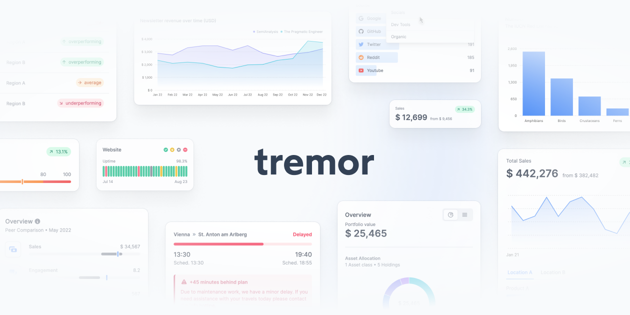

React components for dashboards, metrics, and product dataviz.
40 tools ranked by relevance
React animation library for transitions, micro-interactions, and product motion.
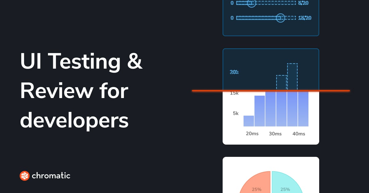
Visual testing and Storybook publishing for design systems and components.
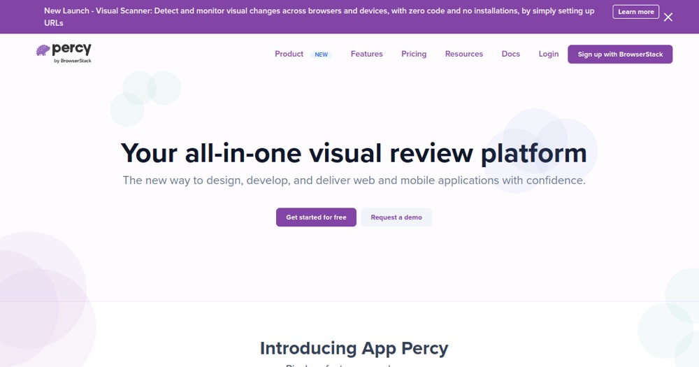
Automated visual testing to catch UI regressions.
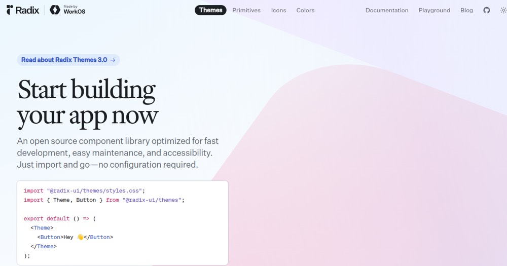
Headless React components for accessible, customizable interfaces.
Utility-first CSS framework for quickly building clean, consistent interfaces.
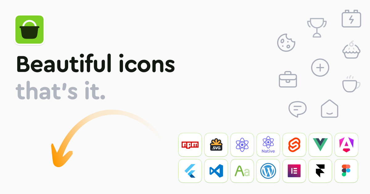
An icon library of 51,000+ UI icons across multiple styles, with dev and design formats, free for one style and paid from $8.25/month.
Online AI photo editor for retouching, background removal and image enhancement.
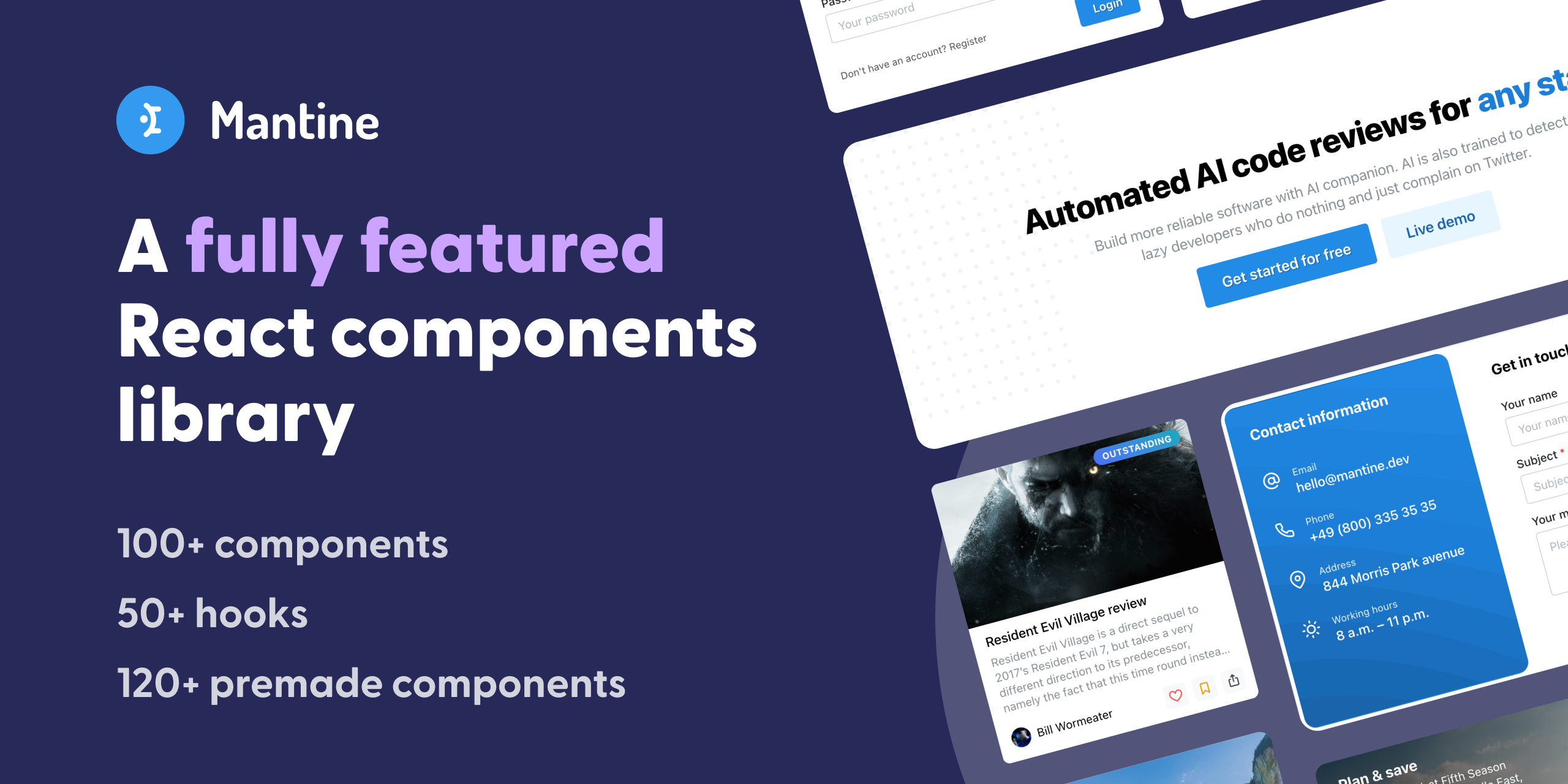
Full-featured React component library with 100+ components and native dark mode.

Fast 3kb alternative to React with the same ES6 API.
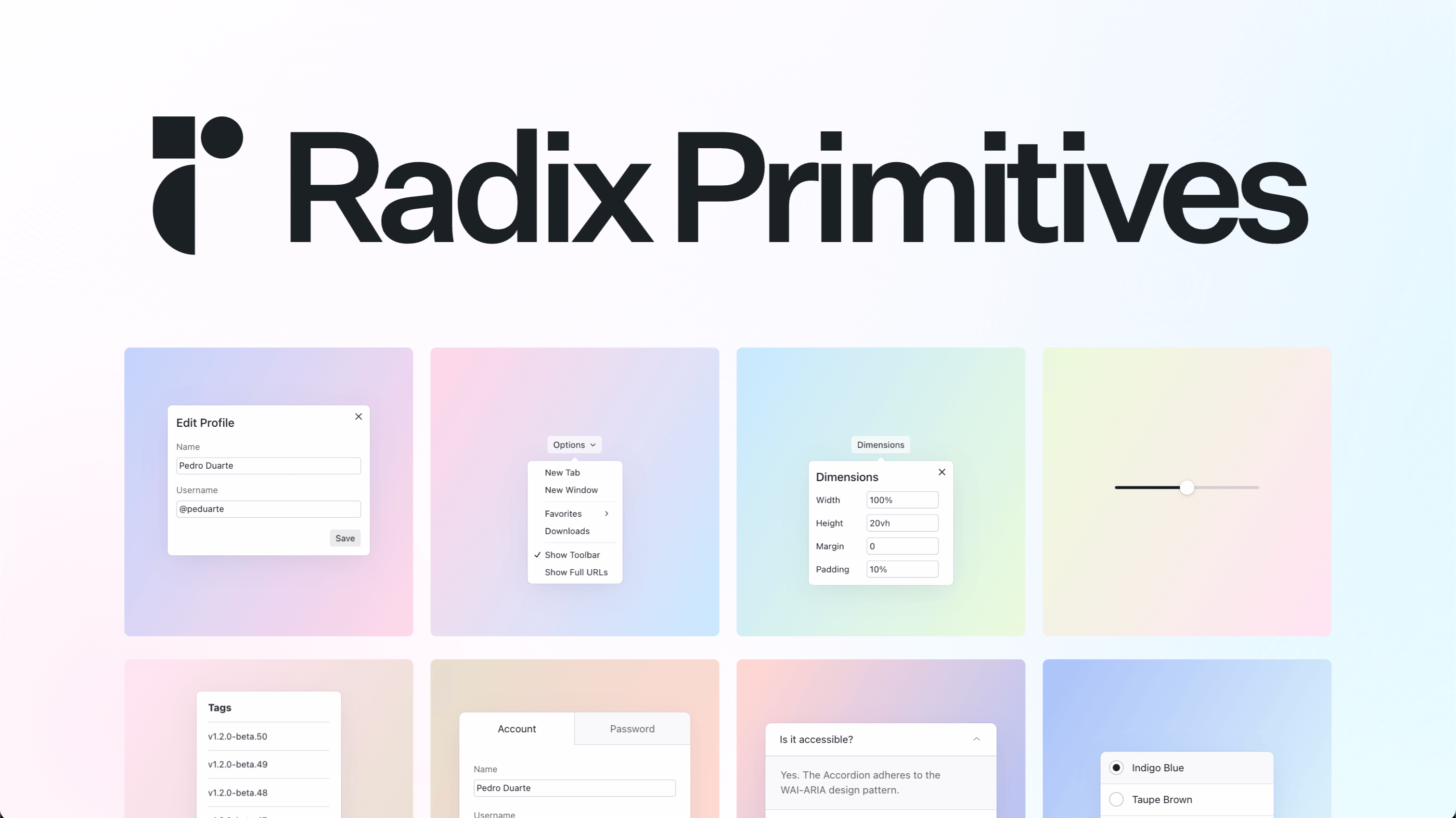
Unstyled, accessible UI components for building React design systems.

Declarative, ultra-performant UI framework without virtual DOM.
UI framework that compiles to vanilla JavaScript with no virtual DOM.
Completely unstyled, fully accessible UI components by the Tailwind team.
Free open-source alternative to Figma — collaborative design and prototyping.
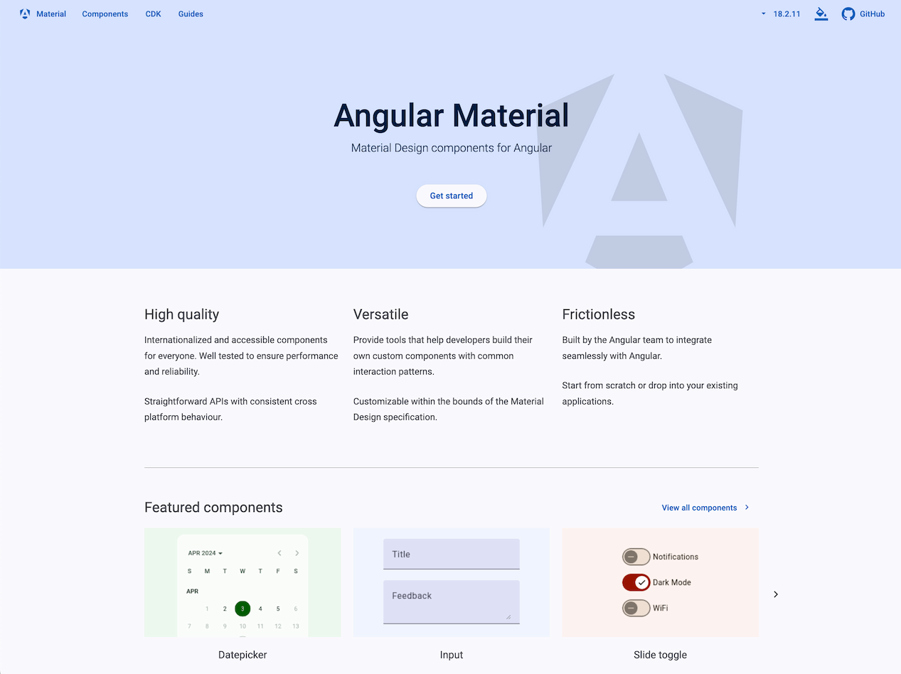
Official Material Design component library for Angular, maintained by Google's Angular team, with the Angular CDK for custom behavior.

React is a free, open-source JavaScript library for building component-based user interfaces, now governed by the independent React Foundation.

React component library implementing Material Design, free and MIT-licensed at its core, with paid per-developer tiers for advanced components.
Accessible, customizable React component collection built on Radix UI and Tailwind CSS, distributed as copy-paste source code, free.

Free, open source React component library for enterprise applications, with theme customization and companion tools for mobile and data visualization.
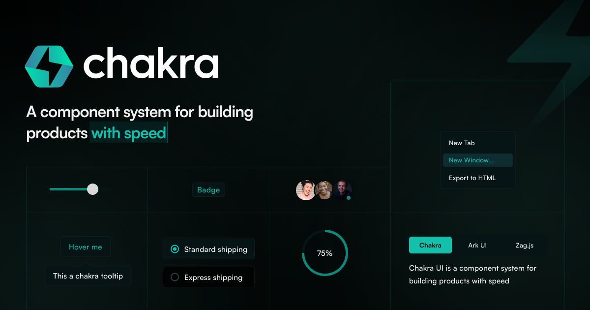
Chakra UI is a free, open-source React component library with accessible pre-built components, design tokens and built-in dark mode.


