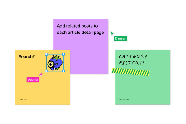

Collaborative digital whiteboard by Figma for brainstorming, team alignment, and planning. Included free with all Figma plans, no additional cost.




Developer workspace inside Figma Design files for inspecting interfaces, connecting design and code, and managing handoff. It requires Figma and a Dev or Full seat on a paid plan.
40 tools ranked by relevance
Collaborative digital whiteboard by Figma for brainstorming, team alignment, and planning. Included free with all Figma plans, no additional cost.
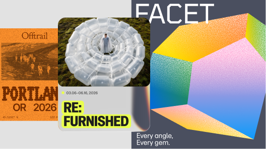
Vector-based interface design tool with real-time collaboration, components and a Dev Mode handoff to code.
An icon library of 51,000+ UI icons across multiple styles, with dev and design formats, free for one style and paid from $8.25/month.

Controlled brand templates teams can adapt at scale inside Figma.
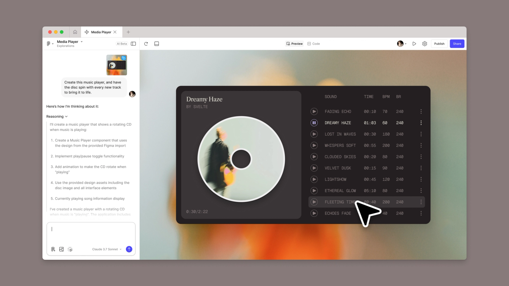
Prompt-driven Figma tool that turns an idea or an existing design into a functional prototype, interactive interface, or web app. It combines generation, code editing, publishing, and design-system context.

Open-beta responsive website builder built into Figma. It turns Figma Design frames into published pages with components, interactions, CMS, code, and AI assistance.

Illustration workspace and advanced vector toolset built into Figma Design. Draw works inside Figma files and is not a standalone application.

Open-beta animation mode built into the Figma canvas. It adds a timeline, keyframes, motion systems, and exports for design and development handoff.

SketchUp tools for simple architectural elements: stairs, openings and construction details.

Collaborative presentation product built into Figma for creating decks, embedding prototypes, and engaging an audience. Advanced Design mode requires a Full seat.
Online AI photo editor for retouching, background removal and image enhancement.
Free open-source alternative to Figma — collaborative design and prototyping.

React component library implementing Material Design, free and MIT-licensed at its core, with paid per-developer tiers for advanced components.
Accessible, customizable React component collection built on Radix UI and Tailwind CSS, distributed as copy-paste source code, free.

Manages design tokens inside Figma and syncs them to code through Git, with branching on paid tiers.

Free, open source React component library for enterprise applications, with theme customization and companion tools for mobile and data visualization.
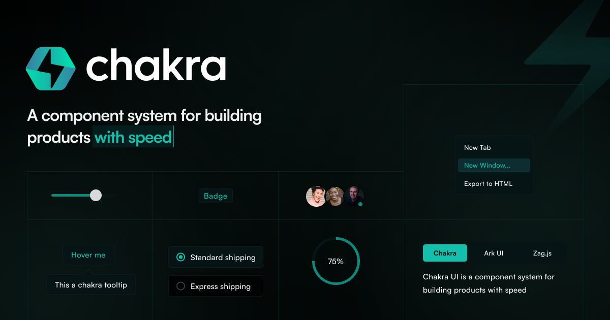
Chakra UI is a free, open-source React component library with accessible pre-built components, design tokens and built-in dark mode.
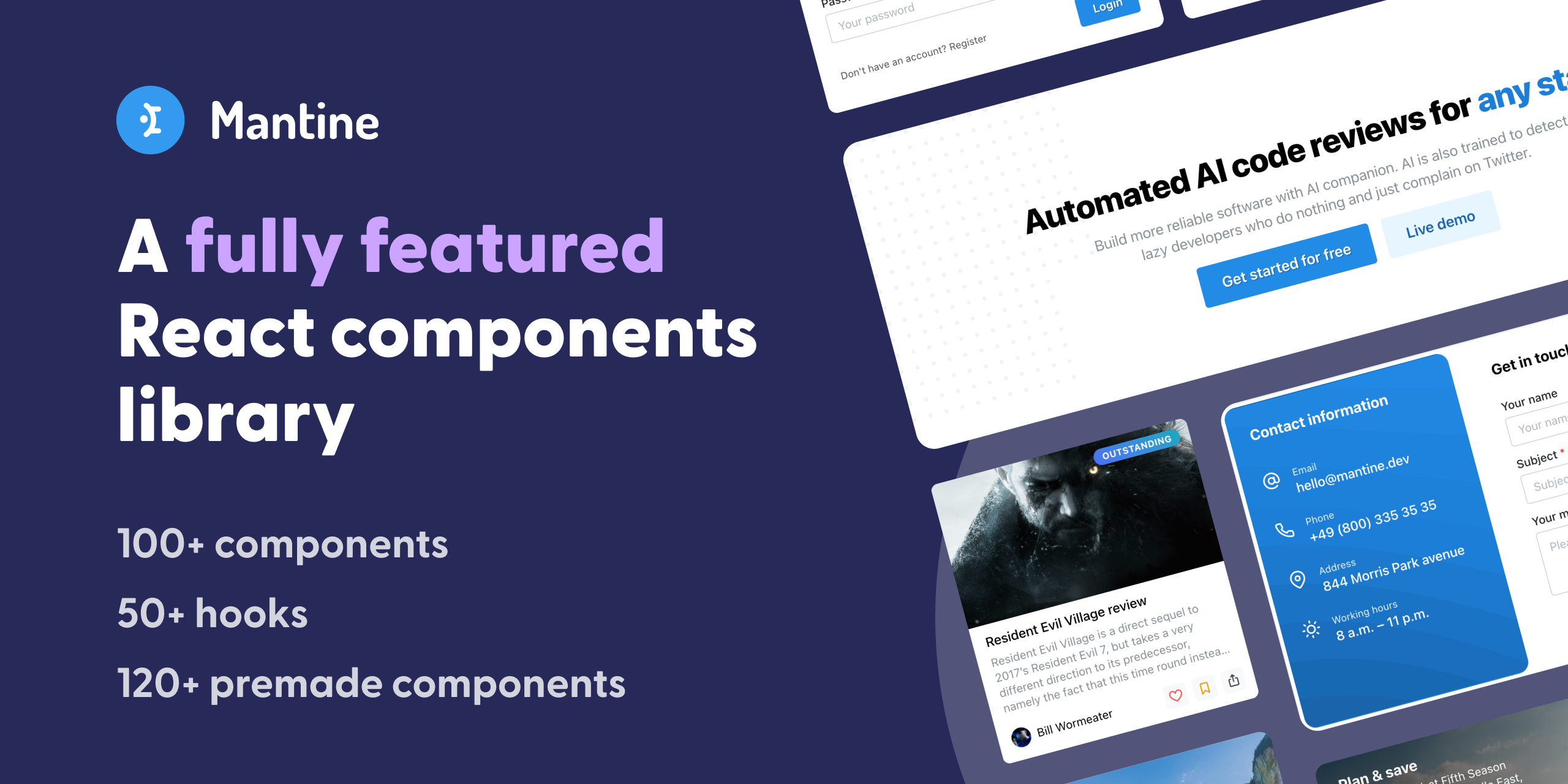
Full-featured React component library with 100+ components and native dark mode.
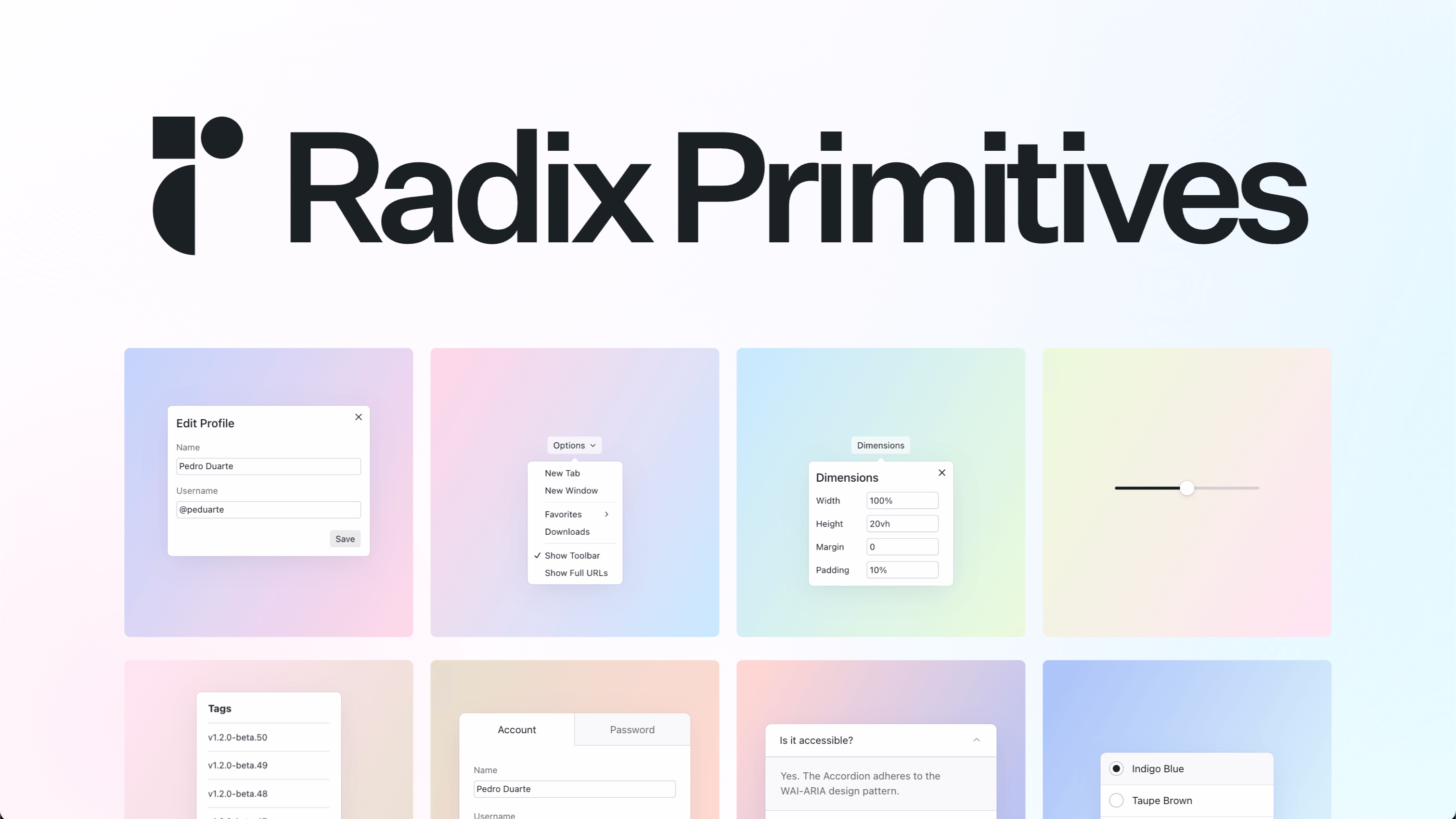
Unstyled, accessible UI components for building React design systems.
A free, open-source tool for building, testing, and documenting UI components in isolation from the main application.